Whether a designer is focused on interior decor, clothing, or household products, they will always keep at least two things in mind when creating something new: the design must be user-friendly and aesthetically pleasing. But what happens when the designer forgets at least one of those crucial aspects and throws out the rulebook? Lucky for us, these hilarious blunders are the result. So get ready to laugh as we take a ride through these bumpy design fails that'll leave you wondering, "What was this person thinking?!"
There Appears to Be a Messaging Error
There's usually a sign on restroom doors that indicate what exactly is on the other side. Often times there is a silhouette to help guests find the right place. However, this gas station decided to have some extra fun with their bathroom doors. The end result leaves us feeling that their bathroom might not be a bathroom. If someone is desperate enough, they might just have to risk seeing what lies beyond.
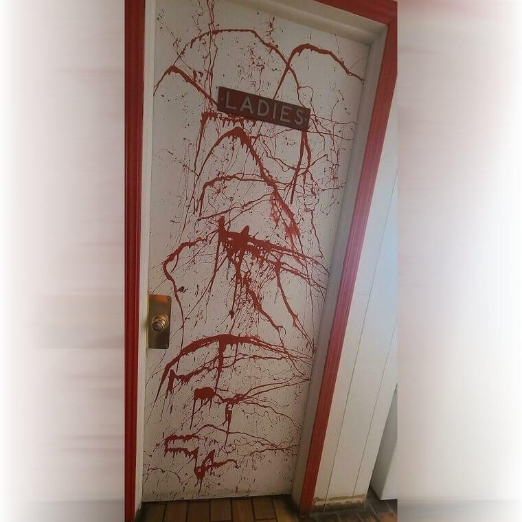
It is alright to be unsure if this is one of the doors to Hell or just a typical murder room splashed in blood in a friendly gas station. Either or, hopefully, it still has a toilet.
People Come in All Shapes and Sizes
We have all heard the expression, "People come in all shapes and sizes." This is a very true phrase that contains a very important message. We should accept everyone no matter their physical attributes. However, whoever designed this t-shirt might have been taking the phrase a little bit too close to heart. Then again, maybe they actually completely forgot that saying.

And that's why this shirt seems to morph into something else entirely when worn by some people.
"Sorry, Perfection Is Not Good Enough Over Here"
Those online quizzes from high school and university years are often strenuous enough to leave a lasting impression on all of us. More specifically, when we would get the wrong answer for misplacing a period or a zero somewhere in the answer box. Nevertheless, the designer behind this quiz felt that even a perfect score was not good enough. We still aren't sure if this serves as motivation to do better or as a sick joke.

Whether it is a sick joke or a motivational tool, this is going to give some students a complex over their quizzes. We believe that 100% are still in style, unlike this quiz's designer.
Someone Definitely Got Fired Over This
Let's take a look at the advertisement below: we see three women, three heads, and three sets of shoulders. But then, as our gaze goes down, we're surprised by four pairs of legs. Either one of these models has four legs (which would be really impressive), or someone messed up the photoshop big time. We're going to guess it was the second option. Which leaves us wondering: how many people missed this huge mistake?

We wonder if more than one person got fired for this big blunder. After all, there's no way only one person looks over these ads.
Always Nice to Find a Good Barbershop, Preferably One Without Violence
Finding the right barber can be a struggle. Getting a haircut gets everyone all itchy, especially when you are a fidgety kid. So it takes time and cares to find the right barber for your child, specifically one who knows how to handle kids. Unfortunately, this barbershop might not be your first choice for where you will be sending your kid for their monthly trim. This ad raises so many thoughts.

It is a simple fact that children cry, but it seems bad marketing to advertise that alongside your services. Add to that the faulty messaging, "We cut kids," and this is one of the worst ads we've seen. And we're very grateful it exists.
The State Department Doesn't Allow Good Passport Photos
This photo is an expectation versus reality situation that we've never seen before. As far as passport photos go, this woman nailed it! Seriously - just looking like a human being means you did a great job taking the photo. We don't even want to think about how many awful shots we've had captured for legal documents like passports and driver's licenses. So she did well. And then the State Department said, "not today!"

They went ahead and ruined her perfectly good photo by elongating her forehead. See what we mean about the standard for a good passport photo being just "look like a human?"
Are We Supposed to Be Calling the Paramedics or Not?
Designers often have to combine various elements in a single image to convey multiple points at a moment's glance. The longer one can stare at an image, the more that the potential consumer can get out of it. This image for an airline company ensures that their potential clients stay hooked to the image for a second long glance. However, we are unsure if we should call the ambulance after seeing the image.

The designer has to be aware that instead of giving us the impression of a fun trip to Europe through their service, we are fearful of having a medical emergency.
Urban Planning Designers Hard at Work Making the City Worse
Those who have ever lived or traveled to an urban area have probably wondered which designer was responsible for making such a confusing layout. The same goes here for the urban planner or designer who designed this street and their plan for handling a flooding road. Often, the grates and drains that would take water away are placed downhill as water moves downhill. However, this designer is challenging the laws of physics.

We have a feeling whoever did this didn't have a good night's sleep before designing it. Or maybe the road's designer knows something we don't yet understand.
Someone Really Didn't Think This One Through
Part of the design process is ensuring that a product or service is accessible to all people. This is especially true for making buildings accessible to folks with disabilities. Unfortunately, even though the thought is obviously there for wheelchair accessibility in this building, they totally missed the mark. So close, and yet so far. They successfully installed a button that people can press to open the heavy doors. Too bad there is an inaccessible curb right in front of it.

It is unclear how anyone in a wheelchair is meant to successfully push the button and get through the door.
A Multi-Million Dollar Blunder
A city in America asked for an artistic sign for their city. Sadly for its residents, many people still haven't heard of the city, 'Derp.' Oh, or is the name of this place 'Lex?' They taught us how to read cursive writing in school, but we just can't figure this one out. Okay, fine, we obviously looked it up. But take a guess before you keep scrolling to see the answer.

It just so happens that this sign spells 'Jax' for Jacksonville, Florida, and it cost them several million dollars to spell. We can only hope no one thought they were in the wrong city after seeing this sculpture.
Clothing Store's Shoplifting Policy Goes a Bit Too Intense
Mannequins have always been creepy with their blank or featureless faces staring down at customers while they peruse the shop. A children's shop has taken its mannequin game to the next level with a unique display design. The designer behind this either is not functioning on the same level as everyone else, or someone needs to check out their internet history because they are getting all kinds of red flags.

Possibly, the designer is trying to be efficient by displaying their product and also using it as a warning to potential shoplifters. Don't worry; just don't shoplift, and all will be fine.
She'll Just Have to Take One for the Team
Everyone has that story of the one time someone pulled the fire alarm as a practical joke. Usually, the story is fabricated, or the practical joker ends up in quite the bind with the law. Obviously, the designer behind this product felt that potential pranksters were a large enough problem that locking the person who pulled the fire alarm into place was the appropriate level of response. "That makes sense," said no one ever.

What does the designer expect to happen when there is a real fire? The person who pulled the alarm will just have to take one for the team?
Old Cat-Human Action Figure Gets Too Excited
Actions figures of our favorite characters are always a joy to have around and to play with as kids. Often the most dangerous aspect about them is that they might get stepped on. Whoever designed this action figure obviously had other things on their mind than merely bringing joy to children around the world. In fact, they might have been too focused on bringing joy to the action figure itself.

Hopefully, this was not the intended design, but it just feels a bit too perfect to not have had some thought behind its creation.
This Feels Like a Glitch in the Matrix
Carpets located in public spaces have gained some infamy for their horrendous designs. Most people often don't pay much attention to the specific designs underneath their feet, and that mindset might just end us in the hospital with this carpet's stripe pattern. It is seemingly impossible to tell if it is the matrix glitching out and the steps have seemingly disappeared or just an optical illusion behind this poor design choice.

Whether it be a glitch in the matrix or a trick of the eye, better watch out if you want to survive your trip down these steps.
The Newest Ear Buds Do Not Even Go in the Ear. Groundbreaking!
Earbuds with cords are annoying because the wires always get tangled. Wireless earbuds are always getting lost. Headphones are too large for convenience. Let us introduce you to the newest craze that everyone is getting into, head-buds. Permanently install your wireless earbuds into your head, and now you will never be annoyed again by tangled wires or losing one in your bag. We get it; human biology is difficult.

And finding the human ear canal can be difficult for anybody. This earbud company might just be onto the next greatest thing in their design error.
Who Wouldn't Want a Platypus in Their Tea -- Wait, Nevermind
Whether you are an expert on the exact scient of tea or you are just a casual sipper of the beverage, there is a certain joy in finding fun ways to enjoy this ancient liquid treat. The designer for this product was challenged with finding a unique method of delivering us tea from the leaves of plants, and they succeeded. However, it also seems to be mildly horrifying.

Is the platypus bleeding to death in your tea, or is the animal simply enjoying a steamy bath? These are important design questions, and either answer would make consuming this drink questionable.
They Went a Little Too Far With the Bike-Friendliness
Listen, we're all for bike-friendly cities. We'd even be fine with bike-friendly stores! Who cares - as long as bikers have their own lane to ride safely. But the Golden Gate Bridge in San Francisco, California, took things too far with its bike lane. It looks like the west coast city is telling their pedestrians they should change their mode of transportation (to one that involves two large wheels, obviously).

But hands-down, our favorite part about this is how this law-abiding citizen took time out of his day to capture this silly moment for us.
Potentially This Baby Model's Last Gig Ever
"Let us use a picture of a baby," the marketing director said. "It will look amazing," they said. It remains unclear why a face of a baby was ever the go-to marketing decision for this water bottle's packaging design. But let's put that aside for now and ask the most important question: who was in charge of placing that baby's head there on the packaging? Because it's not looking so great.

The only thing that experts in the field have been able to hypothesize is that the child is transforming into some underwater sea creature. That would make the design make sense, right?
When Your Fence Is Giving You Mixed Messages
We all appreciate a solid fence. You can put up posters that say "no admittance except on party business," like Bilbo Baggins in the Lord of the Rings. You can even put up barbed wire if you really want to send the message that you are not seeking any company. Whoever designed this fence was obviously going for that exact message but missed the mark by what appears to be several yards: we've got a nice fence with barbed wire and then just open space for anyone who dares step on the grass.

It makes you question the exact function of the fence for its owner. Is it merely for aesthetic reasons, or is it an invitation? The world may never know.
Modern Day Feminism Means Full-Sized Jean Pockets
The struggle for women can be all too real when it comes to finding pants that have actual pockets. Not every single woman is always going to want to ask their partner to carry their belongings or be forced to carry an entire purse for their cell phone. It would seem that misogyny is alive and well in the world, specifically in the clothing world with this jean's pocket design.

Yes, the entire pocket is right there. Yet, it is so far away. The best approach is to defeat this attack on women with a pair of scissors and a sewing kit.
One Advertisement, Many (confusing) Messages
Trimming a dog or any pet can be quite a hassle. It is a lot of work, and it is important to get the right tools for the job. However, the exact message behind this trimmer's advertisement design seems to be sending many error messages. Will this trimmer helps a dog give birth to a hairless, full-grown dog? Or, perhaps, you can simply pull your dog out from underneath its furry mane.

Honestly, the image makes one want to stare longer and longer at it to properly understand its artistic implications. So, we say that the design behind this image was quite effective.
This Cat's Next Meal Might Just Be One of Us
Pet carriers are all the rage and can be a live saver for those who are traveling. In designing an advertisement, it can often be useful to showcase how the product will work. This company did just that. Fortunately, their model received a five-star treatment in their make-up chair. The results seem to indicate that the model might have its owner for its next meal.

Presumably, the photo editing felt that the car merely needed some more color on its face. However, the results might make potential customers run in fright than actually purchase the product.
Multipurpose Design: Sometimes a Bench and Sometimes a Grill
Benches are a great part of parks and their design. They allow space for sitting down, feeding the ducks, and much more now that we have this metal bench. The designer here decided to add the extremely popular bench feature of parks with another popular feature, grill-outs. Now you can do it all together in one spot. The design behind this product is either a sign of genius efficiency or the result of a lack of forethought.

We are going to opt for the positive view that this is a prime example of prime efficiency. Come sit down, and while you do, you can fry up some eggs.
Designing Is Difficult When You Get Your Colors Mixed up
Since time existed, or at least the existence of the traffic light system, there has been an understanding that green means go and yellow means slow. This understanding has manifested itself into dozens of designs with green indicating enter on all keypads. While colorblindness is a common condition, the designer behind this design either forgot to have their work checked by someone who knew their colors or had never used an ATM before.

Green always means enter on these keypads. This design will probably result in people clearing their PINs a few times before they catch on.
What Exactly Is the Sign Telling Them to Do?
Signage in public spaces often is utilized to convey important messages or to provide instructions. When these public parks asked a design team to create a sign, they probably had a very specific message in mind that did not exactly translate to the image that was created. It would be understandable that this might cause people to do a double-take, but that won't make the sign's message any clearer.

Is the sign telling people to urinate on their faces? Is it warning of the dangers of peeing in the direction of a strong gust? So many questions and no answers.
When the Renovator's Sale Person Is Amazingly Convincing
Old castles and ancient towers are probably in need of some external and internal renovations from time to time to keep the building standing. Often renovations will replace the old with the new but keep the same or similar layout and theme to the original. Other times you get a salesman or saleswoman who is just too good at their job, and the results can be drastic.

Whoever convinced this castle's or tower's owner to renovate with this style has too much power and is a menace to society. The same goes for the designer who signed off on this.
Isn't It Terrible When the Last Puzzle Piece Doesn't Fit
Everyone has or at the very least understands how to put together a puzzle. You mix and match until every piece fit within the others around it, and it builds a picture. Sometimes there are those runaway pieces that do not seem to fit anywhere. The designer behind this marketing design has some strongly inaccurate feelings towards puzzles and how they are meant to function. And we obviously want to know why.

Perhaps, the designer's issue is due to personal history with unmatchable puzzle pieces. Their past has created such a delusion that the designer has forgotten the entire function of puzzle pieces.
When Your Parking Lot Comes With a Swimming Pool
Parking lots are hazardous places. While the rules of the road often dictate slower speeds, that doesn't stop how stressful an overpacked parking lot can be to the drivers. The designer behind this parking lot accounted for both by not only including a speed bump in its design to ensure the lower speeds but also a pool so that people can destress after the strenuous activity of parking their car.

While we appreciate the thoughtful design, a pool just seems like an extremely unnecessary addition. Rather, why don't they just put in larger parking spots so everyone can park?
Is It Vitamin D, C, or Magnesium? No One Knows
Medication and vitamins are a common part of everyone's day. Whether taking daily medication or just taking some vitamin C to stave off the cold that everyone has around you, it is often beneficial to the consumer and the provider to know what medication you are taking. However, the designer behind this Magnesium vitamin bottle got a bit too ecstatic with the packaging bottle, leaving all of us confused.

The first glance tells us its vitamin D; the second glance tells us something more; by the fourth glance, we might just begin to understand that the bottle is happy to see us taking some vitamin C.
Those Grammar Rules Are Really Working Against Us
Word choice is paramount in a word-based marketing campaign. They can often be misconstrued if the meaning is clear and the saying or phrase has to be on point and short to stick in people's minds. The designer of this campaign surely did not take any of that into account with this one. It is giving us many different messages, and honestly, none of them are beneficial to us.

Is it telling us to drink and drive due to a double negative? Is it saying don't drink but do drive high? None of these seem exactly on point.
We Accept Ducks in All Their Shapes and Sizes
People and animals can be shaped in many different ways, and no matter how they are shaped, they still matter. The designer behind this plushie is attempting to challenge the social standard that all ducks are born with two webbed feet and two wings. The message here is beautiful and speaks to how we, as members of society, need to challenge our perceptions of ducks. Or the designer just made a mistake.

Whether it is a mistaken design or a powerful social justice message, it does look truly adorable. We all would happily adopt a duck with four stumps after seeing this cutie.
Misspelling Accidentally Leads to the Erasure of Human Existence
We have all sent a perfectly normal text or message that dramatically changed its intended meaning due to autocorrect or a simple misspelling. Often these lead to brief moments of embarrassment or confusion. However, misspellings have yet to lead to the erasing of an individual before today. The designer behind this product simply had a misspelling, but the fact that it got to this stage before someone noticed is a cause for concern.

Are we supposed to feel threatened by the designer? Either way, this parking garage is extremely serious about everyone paying their parking fee.
Not Recommended for Actual Use
Compasses are often artistically imprinted onto maps or functionally used through modern-day phones or traditional outdoor equipment. These often can either help someone find themselves out of an unknown area or assist in deciding where to go next for your upcoming trip. The designer behind this specific product felt a specific love for the compass and decided to imprint them on pillows for one's enjoyment. However, we would not recommend using them if you are lost.

While there are many topics and subjects from our primary school days that have slipped by us, most of us know our directions. We are certain that all of us, except this designer, know that below North is South and the opposite of East is West.
That Is Not Our Childhood Winnie the Pooh
Winnie the Pooh is a staple of many people's childhoods. Often seeing his and his friends' adventures on TV, in the movies theaters, or in the books filled our young hearts with joy. However, it would seem that in recent years Winnie has been having a tough time. Whether he is waiting for his dentist appointment or waiting to feed off of our childrens' dreams, we are not sure.

Whether Winnie has been co-opted into nightmare fuel for us or if he just has a terrible toothache, we wish him well and thank him for many great childhood memories.
Remember Kids: Be Polite When Talking to Santa
Santa Claus is a festive character that brings in the season of joy, smiles, and gifts. Christmas time is often a high point of many people's years. Usually, that means Christmas-themed designs are unleashed on the public. Here, the designer felt that the stop sign needed some festive themes. However, the message that it creates is not one of joy but rather creates questions about Santa's moral character and what he's doing to this child.

Remember that it is important to be a good person to get gifts from Santa, and also always remember to have a 'safe word' when it is appropriate.
Math Is Hard and There Is No Shame in It
How many times did we, as students, say that we would not need to understand this complex mathematical formula to get through life? All of the time. While understanding what 'x' equals might not be prevalent in our day-to-day life, counting sure is useful. Sadly, whoever designed this elevator's button had a torturous time getting through math class. Not only are the numbers not in order, but there are not even enough buttons to get to floor 40.

We think we are just going to take the stairs before getting stuck in this elevator for eternity as we look for floor 2.
Modern Art Has Been Taken Way to Far Here
Modern art and the modern architectural movement have seen many unique house designs and concepts. It would appear that someone with a modern art degree was in charge of crafting this masterpiece of a staircase. It has a dual-purpose style that serves as both a staircase and a bookshelf. The idea is nice, but whoever had designed this staircase had never stepped on a toy when walking down the stairs before.

This might just be the modern-day equivalent of a torture device. Imagine walking down for a cup of water in the middle of the night only to be assaulted by your houseplants and books at the same time.
Geopgraphy Just Got a Lot More Complicated (or Simple? )
We all remember taking those geography quizzes where students had to name random countries or states in different parts of the world. They were, oftentimes, extremely difficult to remember all of those locations. However, they didn't teach people that if you did not remember a country or continent, you could just remove it from the world's map. We feel for whoever designed this product, and we can all imagine that Geography 101 might have been an optional course for them.

Can't remember where France, Britain, or any other European country is on the map? Simply erase the continent, and you are sure to get a 100% on the next pop quiz.
Word Choice Is Always Very Important
A major aspect of any design for an advertisement or a phrase for a marketing campaign is ensuring that the words match the message of the company and the products or services being marketed. The wrong word choice or the wrong sentence can spell a myriad of complications, for example, sending the potential customer the wrong message. Here is one prime example of such an error in word choice.

Giving them the benefit of the doubt, we assume no one read that sentence aloud in the marketing meetings. Thank heavens they made the safe decision of sticking with earholes for the photo.
We Have the Best Pizza, Period Versus...
What do you think they meant to write on this pizza box? "We have the best pizza, period," as in "this is the end of the discussion; it's the absolute best?" Or, "We have the best period pizza," as in -- we don't even want to get into it. These kinds of design flaws shock us mostly because we're sure there was more than one pair of eyes approving this box. So how did so many people get it so wrong?

Was no one taught that word order matters? Did no one read this out loud? We have so many questions.